

Fire Department Logo Design Tips for Shirts
Table of Contents
- Why Fire Department Logo Design Matters for Duty Wear
- Fire Department Logo Placement Standards on Shirts
- Design Best Practices for Clarity and Legibility
- Fire Department T-Shirt Design Ideas That Honor Tradition
- Best Screen Printing File Formats for Fire Service Apparel
- Technical Print Specifications and Accessibility Standards
- Working with Professional Graphic Designers
- Common Design Mistakes to Avoid
- Frequently Asked Questions
Last Updated: September 29, 2026
Why Fire Department Logo Design Matters for Duty Wear
A well-designed fire department logo design tells the story of your crew. It's not just a graphic on a shirt, it's a symbol of identity, tradition, and pride.
When firefighters wear apparel with a thoughtfully designed logo, something shifts. The shirt becomes more than fabric. It becomes a statement about who you are and what you stand for. That's why getting the design right matters so much.
At Black Helmet, we understand the importance of logos that resonate. The difference between a rushed design and a purposeful one shows up immediately. Firefighters notice. The public notices. Your crew feels it.
A strong logo serves multiple purposes. It unites your crew visually. It communicates professionalism to the community. It honors the traditions that define your department. And when that logo is printed on quality apparel, it becomes something your team actually wants to wear.
The stakes are higher than most people realize. A poorly executed design can cheapen your image. A thoughtful one elevates it. This guide walks you through the principles that separate strong fire department logos from forgettable ones.
Fire Department Logo Placement Standards on Shirts
Where you place your logo matters as much as the design itself. Placement affects how the design reads, how durable it is, and how professional the final product looks.
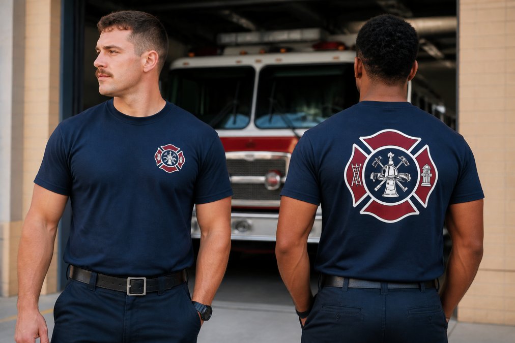
The most common placements are:
- Left chest logo: Small to medium size, typically 3-4 inches wide. This is the standard for duty wear and creates a professional, understated look.
- Full back design: Large format, spanning most of the back. This creates visual impact and works well for station pride wear and off-duty apparel.
- Sleeve placement: Left or right sleeve, usually 2-3 inches. This works best as a secondary element, not the main focus.
- Combination approach: Small left chest logo plus a larger back design. This gives you flexibility and visual balance.
The left chest placement is your safest choice for professional duty wear. It mirrors the placement of badges and patches on actual uniforms. It reads clearly from a distance. And it doesn't overwhelm the shirt.
For full back designs, make sure your logo scales up effectively. A design that looks good at 3 inches might look muddy at 12 inches. Work with your designer to test the scaled version before printing.
Design Best Practices for Clarity and Legibility
A logo that looks great on a computer screen might fail when printed on a shirt. Scale, color, and complexity all change how your design reads in the real world.
Start with simplicity. The best logos work at any size. If your design falls apart when shrunk to 2 inches, it's too complex. Firefighters spend decades recognizing symbols quickly. Your logo should follow that principle.
Choosing the Right Color Palette
Color choices affect both how your logo looks and how much the print costs. Full-color designs require more ink and careful color separation. Single-color designs are simpler and often more striking.
The most effective fire service logos use two to three colors maximum. Red and black is the traditional combination for a reason. It's bold. It's recognizable. It reads clearly on apparel.
Consider contrast. Your logo needs to pop against the shirt color. A dark logo on a dark shirt disappears. A light logo on a light shirt does the same. Test your color choices against your actual apparel color before committing to the final design.
Typography and Visual Hierarchy
If your logo includes text, typography is everything. Avoid thin, delicate fonts. They don't survive the screen printing process well. Bold, clean typefaces hold up better and read faster.
Establish clear visual hierarchy. Your department name should be the dominant text. Badge numbers or mottos should be secondary. Cramming equal-sized text into your logo creates visual confusion.
Spacing matters too. Tight text is hard to read. Give your letters room to breathe. When your design is printed at actual size, you'll be grateful for that breathing room.
Fire Department T-Shirt Design Ideas That Honor Tradition
Great designs balance tradition with clarity. They reference what your department stands for without becoming cluttered or clichéd.
Classic Maltese Cross and Department Identity
The Maltese cross is the most recognized symbol in the fire service. It works because it's simple, symmetrical, and loaded with meaning. If your department uses a Maltese cross, lean into it.
A strong approach: place the Maltese cross as your primary focal point, then add your department name and station number around it. This creates a complete identity mark that works at any size.
The key is avoiding overcomplication. Don't add extra decorative elements around the cross "just because." Let the symbol do the work. The strongest designs are often the simplest ones.
Full Back Designs vs. Left Chest Logos
A left chest logo works for duty wear and professional settings. A full back design gives you room to tell a bigger story.
Classic Skull Logo Premium Tee →
Full back designs can include:
- Your department's motto or mission statement
- Imagery that represents your specific role (structural, wildland, rescue, etc.)
- Commemorative elements or dates
- Larger, more detailed versions of your primary logo
The advantage of a full back design is flexibility. You can include more text, more visual complexity, and more storytelling. The disadvantage is that it works best on casual apparel, not duty wear.
For many departments, the ideal approach is both: a small, professional left chest logo for duty shirts and a larger back design for station pride wear and casual apparel.
Best Screen Printing File Formats for Fire Service Apparel
Your design file matters more than most people realize. The wrong format creates problems during printing. The right format ensures your logo prints cleanly and consistently.
Vector graphics are non-negotiable. Vector files (Adobe Illustrator .ai.eps, or .pdf) scale infinitely without losing quality (Vector files: How to create, edit and open them). Raster files (JPG, PNG) pixelate when enlarged. For screen printing, you need vectors.
When submitting your design to a printer, ask what format they prefer. Most screen printers work with:
- Adobe Illustrator (.ai)
- Encapsulated PostScript (.eps)
- Portable Document Format (.pdf)
These formats preserve your design's integrity throughout the printing process. They allow the printer to separate colors accurately and adjust sizing without degradation.
Avoid submitting designs in Word documents or PowerPoint files. These are not print-ready formats. They cause alignment issues and color problems. A professional printer will ask you to resubmit in the correct format.
When you export your design, make sure all text is converted to outlines. This prevents font substitution errors during printing. It ensures your design prints exactly as you intended.
Technical Print Specifications and Accessibility Standards
Screen printing involves technical specifications that affect the final result. Understanding these prevents costly mistakes and ensures your logo prints correctly every time.
High-Visibility Requirements for Firefighter Gear
If your department uses high-visibility apparel for safety, your logo placement and color choices must account for visibility standards.
According to NFPA standards for firefighter protective clothing, reflective elements must meet specific brightness and placement requirements. Your logo design should complement these requirements, not compete with them.
Plastisol Ink Coverage and Durability
When you work with a printer, discuss ink coverage specifications for your specific design. Different colors require different coverage rates. Red needs more ink than black to achieve the same vibrancy.
Working with Professional Graphic Designers
A good designer asks questions before starting:
- What's your budget?
- What apparel color are you printing on?
- How large will the logo be printed?
- Do you need a one-color or multi-color design?
- What's your timeline?
These questions shape the entire design approach. A designer who doesn't ask them is working blind.
Communication matters too. Share your department's history, values, and identity with your designer. The strongest logos emerge from understanding what your crew stands for, not just what looks trendy.
Expect revisions. A designer should provide multiple concepts and refinements. If they're resistant to feedback or changes, that's a red flag.
Common Design Mistakes to Avoid
Most design problems fall into predictable categories. Knowing what to avoid saves time, money, and frustration.
| Design Element | Best Practice | Why It Matters |
|---|---|---|
| Color palette | 2-3 colors maximum, strong contrast | Prints cleanly, holds up over time |
| Logo size | Scales effectively at 2-12 inches | Works on any apparel placement |
| File format | Vector graphics (.ai.eps.pdf) | Maintains quality at any size |
| Text | Bold fonts, adequate spacing | Survives printing process clearly |
| Placement | Left chest or full back | Professional appearance, durability |
| Ink coverage | Proper density for color | Resists fading through repeated washing |
Frequently Asked Questions
What are the best file formats for screen printing fire department shirts?
Vector graphics in AI, EPS, or PDF formats are ideal for screen printing because they scale without quality loss. PNG or high-resolution TIFF files (300 DPI minimum) work for raster images. Avoid JPEGs for final artwork as they compress and degrade detail. Submit print-ready files with proper color separation, and confirm your printer's specific requirements before sending artwork. This ensures crisp, durable prints that hold up through repeated washing.
What should I know about fire department logo placement standards on shirts?
Left chest placement mirrors traditional uniform standards and creates immediate department recognition. Full back designs work for crew identity and larger graphics. Ensure logos are sized proportionally: left chest logos typically 3-4 inches wide, back designs 6-8 inches. Maintain adequate white space around the design, and position logos high enough to remain visible when wearing gear or equipment. Consistency across crew shirts strengthens department brand identity.
What fire department t-shirt design ideas actually resonate with firefighters?
Designs honoring the Maltese cross, station number, or department patch create authentic connection. Incorporate the firehouse dog motif or 'First In, Last Out' messaging for brotherhood recognition. Avoid novelty humor or generic imagery. Wildland firefighters respond to rugged, practical designs reflecting their work. Retired firefighters prefer designs that honor legacy without feeling costume-like. Test designs with your crew before committing to production.
Why does high-visibility matter in fire service apparel design?
High-visibility principles can enhance safety awareness. This balances professionalism with safety awareness, reinforcing the seriousness of the fire service.
